Cracker Barrel CEO Julie Masino Admits She Misjudged Customers’ Bond With Iconic Brand After Logo Change; Traffic Falls 8%
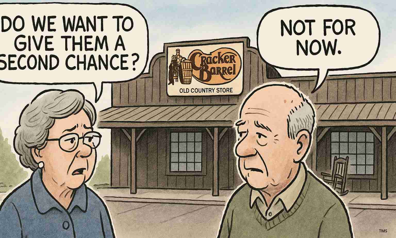
Cracker Barrel CEO Julie Masino admitted the company misjudged customers’ attachment to its vintage branding after an August 2025 text-only logo sparked backlash, driving an 8% traffic decline and prompting a swift rollback to classic elements.
- Customer traffic fell 8% after the August logo change. Source
- Quarterly results: revenue $868 million, down 2.9% year-over-year; adjusted net income $14 million ($0.40 per share, non-GAAP); adjusted EBITDA $130 million. Source
- Market reaction: shares plunged nearly 10% in after-hours trading and the company lost an estimated $140+ million in market value at the height of the controversy. Source
- Brand reversal: the company rolled back the new logo, halted remodels (only 4 of 660 stores remodeled) and saw loyalty sign-ups rise by ~300,000 in four weeks. Source
What happened: the logo change and the backlash
In August 2025, Cracker Barrel introduced a simplified, text-only logo and began testing modernized interiors intended to broaden appeal and update the brand. The redesign removed the familiar old-timer leaning on a wooden barrel — a longtime symbol of Southern roots and comfort.
Rather than attracting new guests, the change sparked widespread online fury and vocal criticism from regular diners who said the refresh stripped away a defining part of the restaurant’s identity. Critics characterized the redesign as a departure from tradition, labeling it “woke” and framing it as an abandonment of heritage — a narrative that spread quickly across social and conservative media outlets. Source
Financial hit: traffic, earnings and shares
The customer backlash translated into measurable financial impacts. Company figures show an 8% decline in customer traffic since the August logo change. Quarterly revenue fell to $868 million, down 2.9% year over year. Adjusted net income was $14 million (or $0.40 per share, non-GAAP) and adjusted EBITDA reached $130 million. Source
Investors reacted sharply: shares dropped nearly 10% in after-hours trading when the earnings and backlash became public. At the controversy’s peak, the company lost an estimated $140 million+ in market value. Only four of 660 stores had been remodeled under the new concept before leaders halted the program, limiting the rollouts’ financial exposure but not preventing reputational damage. Source
CEO admission and company response
“We deeply value the strong emotional connection our guests have, not just to the old-timer logo or vintage Americana decor, but to the sense of tradition and nostalgia those represent…that connection is powerful,” said CEO Julie Masino.
On the Q4 fiscal-year 2025 earnings call, Masino acknowledged the company “misstepped” and thanked patrons for candid feedback. In response, Cracker Barrel restored the classic old-timer logo and rolled back modernized test-store interiors, committing to refocus marketing on nostalgia, core menu items and heritage branding. Source
Operational moves and customer outreach
Beyond branding, the company announced operational shifts aimed at winning back guests. Leadership moved to reinstate menu staples such as “Uncle Herschel’s Breakfast” and launched a new service approach called “The Herschel Way” to improve guest experience and speed.
Those efforts coincided with a rapid spike in loyalty program engagement — roughly 300,000 new sign-ups in four weeks — suggesting the immediate outreach resonated with many customers. Executives described these moves as part of a broader multi-year plan to improve food and guest experience while placing renewed emphasis on preserving tradition. Source
Investigative look: what went wrong and why it mattered
Cracker Barrel’s brief experiment underscores how brand identity functions as more than aesthetics for legacy casual-dining chains. The old-timer logo and farmhouse interiors signal a promise of familiar food, conservative values and a predictable dining routine. Removing those cues risked alienating the core customer base that had sustained the chain through economic cycles.
Leaders said the goal was modernization and attracting new guests, but they underestimated how central nostalgia and tradition are to customers’ dining choices. The cautious rollout (only four remodeled stores) indicates an attempt to test changes, yet social reaction and the 8% traffic drop revealed a deeper brand attachment than executives anticipated. Source
Implications for Redding, California
Cracker Barrel has no known locations inside Redding city limits, but the episode carries regional economic, political and cultural implications for Northern California communities.
Economic impact
A slowdown in Cracker Barrel traffic and potential pauses to expansion or remodeling plans could ripple to regional suppliers, distributors and contractors that service multiple restaurant brands. Reduced rollout activity may mean fewer local projects in Western-California supply chains and construction pipelines. Source
Political consequences
For conservative audiences in Redding and Shasta County, the controversy reinforced tensions between corporate branding choices and expectations about tradition. The “woke” framing amplified conservative networks’ response, turning a design decision into a cultural and political flashpoint that local leaders may leverage in debates over corporate influence and cultural values. Source
Social effects
Nostalgia for Americana resonates with many Redding residents; the chain’s backtrack highlights that customer voices can influence brand decisions. Local diners may increasingly favor restaurants that emphasize traditional decor and menu staples, and competitors may lean into heritage branding to attract patrons seeking familiar experiences. Source
Cultural relevance
The reversal illustrates how symbols — like the old-timer logo and farmhouse interiors — carry cultural meaning. For conservative Californians, these elements represent tangible Americana; local institutions and events in Redding may emphasize traditional themes to attract families and older customers stirred by the national controversy. Source
Practical applications for residents
- Dining choices: Patrons who value tradition may prioritize restaurants that publicly embrace Americana decor and classic menu items; expect increased nostalgia-focused marketing locally. Source
- Local businesses: Contractors, designers and vendors involved in restaurant remodels should monitor possible shifts in demand as national chains rethink modernization strategies. Source
- Civic engagement: The episode may spur consumer-advocacy action and calls for transparency when corporations alter longstanding community-facing symbols. Source
Source
Full reporting on the earnings call, traffic decline, brand rollback and CEO comments is available from Times Media Service and summarized in coverage at AOL.